Looking back:
Because of the often described “neutral” (quote from the Helvetica movie) quality of Helvetica, many corporations and entities have adopted Helvetica as they house face.
While the typeface was appropriate for many of the more traditional German or American companies like Deutsche Bahn, Deutsche Post or American Airlines, Helvetica is not at all the timeless masterpiece many fans claim it to be: It is very much a product of its time. It is a 60s typeface, grown out of 60s modernism, with all the dealings of 60s taste, design and charm.
This is not just an empty claim. Of the three companies mentioned above, none use Helvetica anymore. Deutsche Bahn commissioned their own proprietary typeface, Deutsche Post moved to the more open, friendly and humanists Frutiger, and American Airlines also commissioned their own typeface, one closely related to humanist types like Frutiger and Thesis.
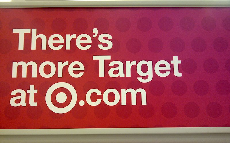
Others, like North American Retailer Target, have gone a different route. Also traditionally bound with Helvetica, but riding the same fresh Wind of change and renewal, Target adopted their own version of Helvetica with rounded dots and punctuation, as well as more consistent letter-shapes.
Looking forward
Some companies, like like Commercialtype for Fontbureau have been going back to Helvetica's Neue Haas Grotesk origins and updating its design as well. (Interestingly, Commercialtype is also working on an Neue Haas Grotesk with Rounded Dots).
If you are viewing this website in a modern browser, you may notice that it itself is set in a Helvetica with rounded dots and alternate Lettershapes. The typeface of this website is Rotesk, my very own take on Helvetica.
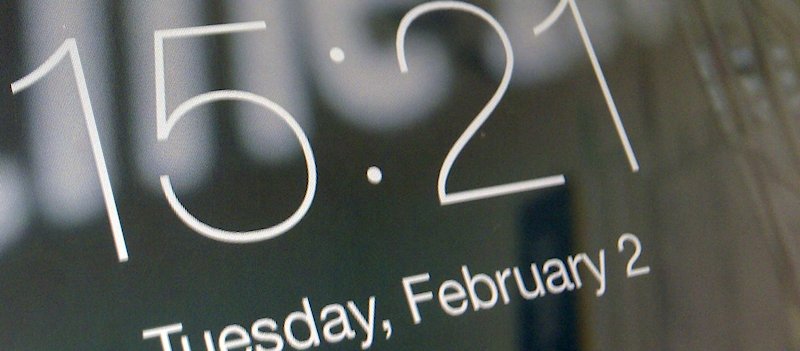
Apple, in an effort to make Helvetica more friendly during its controversial (and luckily short-lived) time as Apples UI face, also made subtle changes, like the rounded Dots on the lockscreen on IOS devices.
Finally, let's not forget Helvetica's influence on many modern screen fonts, from Monotype's Arial to Apple's San Francisco or Googles Roboto.
In many ways, the much-hated, Microsoft-popularized Helvetica “Clone” Arial is very much a re-envisioned version of Helvetica based on Monotype's own Monotype Grotesque in the same way Helvetica was to Akzidenz Grotesk, and the way San Francisco and Roboto are today.
Does this mean there is a future for Helvetica? It has become so ubiquitous, so widly adapted, that it cannot be deleted from the collective mind and popular culture.
But as time goes on, modernist designers retire, die off, and their teachings get adapted and overridden and re-envisioned, we will see the style of Grotesque Sans faces evolve. Be incrementally or radically, but certainly always youthfully.