Why?
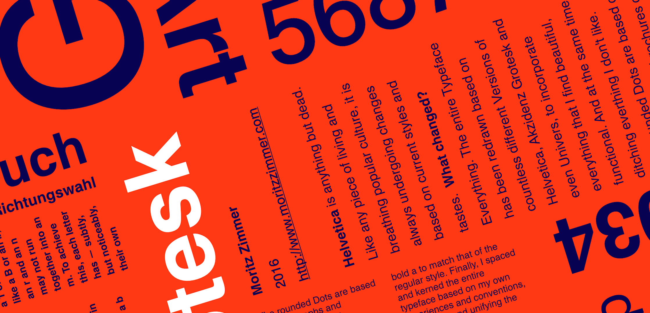
As we have seen in the future page, Helvetica is anything but dead. Like any piece of living and breathing popular culture, it is always undergoing changes based on current styles and tastes.
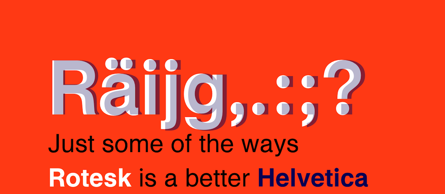
Ever since I noticed Targets gradual change to a Helvetica with rounded dots, I was fascinated with the idea, and wanted to re-draw Helvetica as my own, original design.
What changed?
Everything. The entire Typeface has been redrawn based on countless different Versions of Helvetica, Akzidenz Grotesk and even Univers, to incorporate everything that I find beautiful, functional. And at the same time ditching everthing I don't like.
The rounded Dots are based on photographs and brochures of Target Helvetica. The letters and numbers are redrawn, made softer, rounder, friendlier, on occasion even more square.
The lowercase a in Helvetica is missing the stem in the Bold weight. This always bothered me greatly. I redrew the shape pf the lowercase bold a to match that of the regular style. Interestingly, it was not until later that I realized Target Helvetica did the same thing.
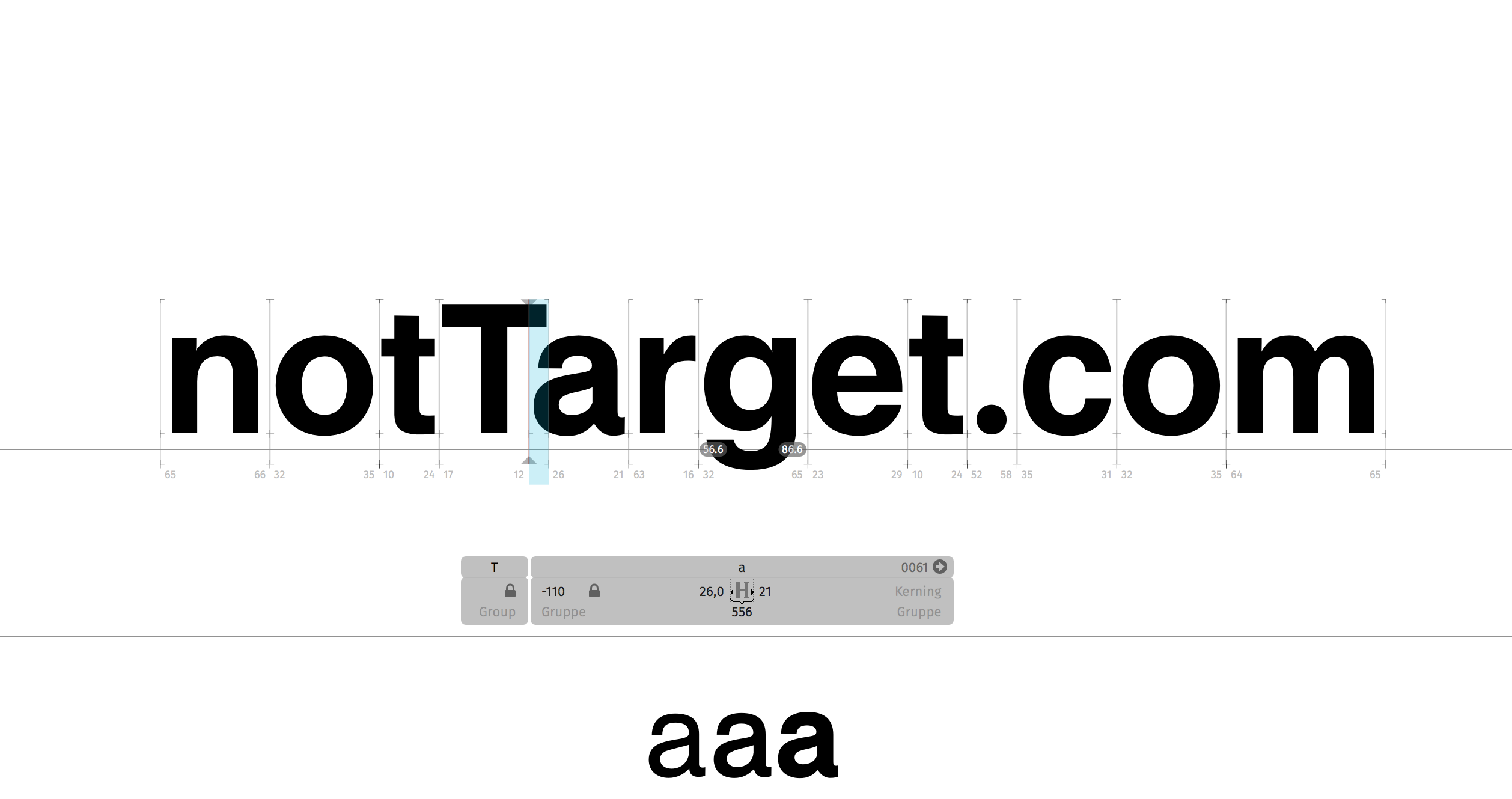
Finally, I spaced and kerned the entire typeface based on my own experiences and conventions, simplifying and unifying the process.