Lufthansa and AmericanAirlines Logos
Lufthansa’s use of Berthold Helvetica vs. the old AmericanAirlines Logo set in a different version.

It's all in the Medium

It is important to point out that there is not one Helvetica. Infact, there are so many different Helveticas, it would probably be impossible to list them all. Bur especially concerning major revisions, what unites them all is the fact that they are all children of their medium.

Metallica:

Variations started as early has 1959, when the Stempel foundry in Frankfurt began making versions of the typeface for Linotype printing machines. In fact, it was only this — completely redrawn and specially fitted — version of the typeface that initially carried the name Helvetica, in an effort to make the typeface more easily internationally marketable.

Photovetica:

When typesetting moved from metal to photosetting, the Typeface again was redrawn and respeaced, to fit the new 18-unit spacing grid imposed by the early technology.

Digitalica

When Helvetica moved into the digital medium with the first PostScript printers and software, it again changed. You can probably even tell this from the fact that every modern Macintosh Computer has at least two versions of the typeface installed: The Photosetting sourced Helvetica, and Neue Helvetica (not Helvetica Neue), a redesign of the redesign.

Frutiger's Univers, a Helvetica Sister.
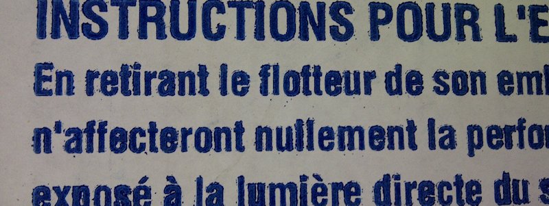
Messy print of a Helvetica variant.

Not really Helvetica...Part Two

Many of the Helveticas from the (post) photosetting time are interestingly not Helvetica at all. Because of the unique situation in US copyright law, in which only the physical or digital “font” (the actual physical or digital manifestation, or data) is copyright protected, but not the design, many foundries in the pre-digital era made they own version of Helvetica, that would work specifically with their equipment.

Geniune Siblings:

Helvetica is certainly a very outstanding design: but it is not quite as unique as especially many fans in the United States may have you believe. Not only is it obviously related to it's ancestral AG, but Helvetica also has a prolific Sister, Adrian Frutiger's Univers, which shares much of the same ideas of Helvetica, but resolved them in a different way.

(You can see the similar horizontal terminals in both typefaces. Note the looser spacing in Univers and the different Lettershapes)

Digitally condesed variant of Neur Helvetica on an Exit Door
Digitally condensed variant of Neue Helvetica on on an Exit Door.